GRK Hero Image

GRK

Modern fresh greek food.

PROMPT

Prompt Icon
Design Direction, Branding & Print Design

-

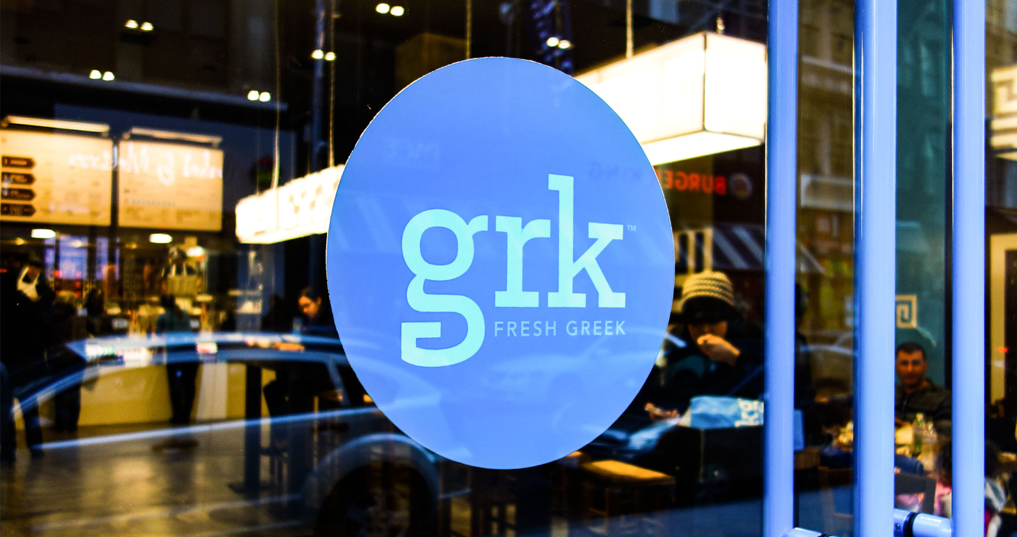
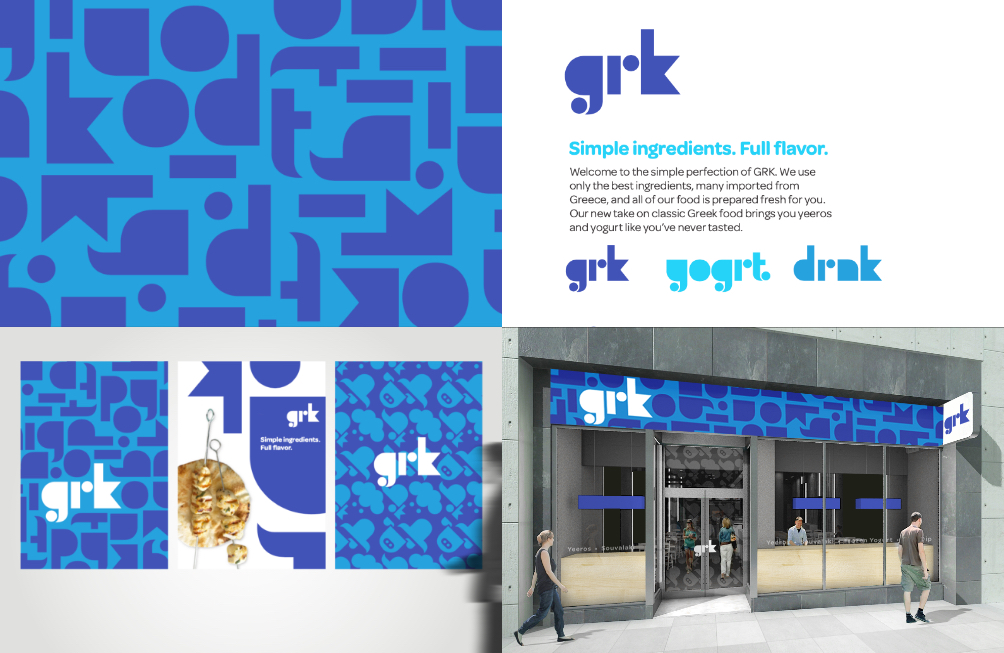
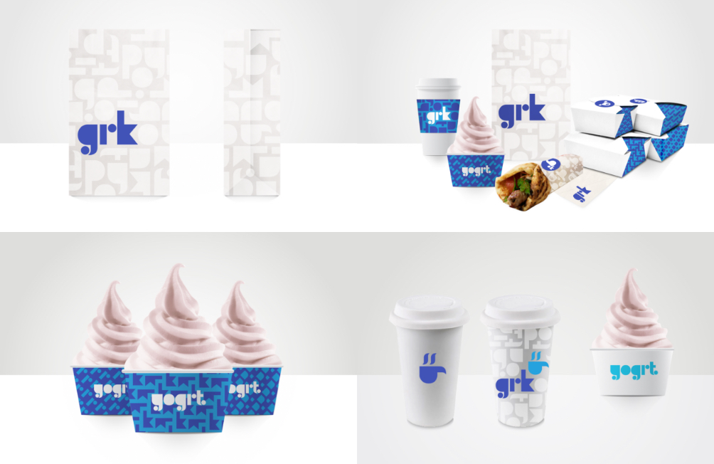
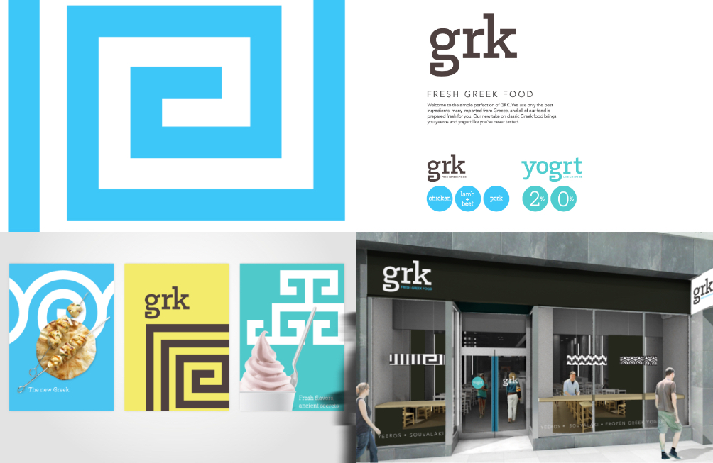
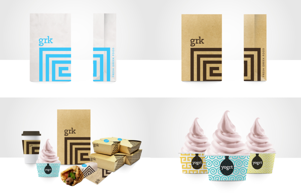
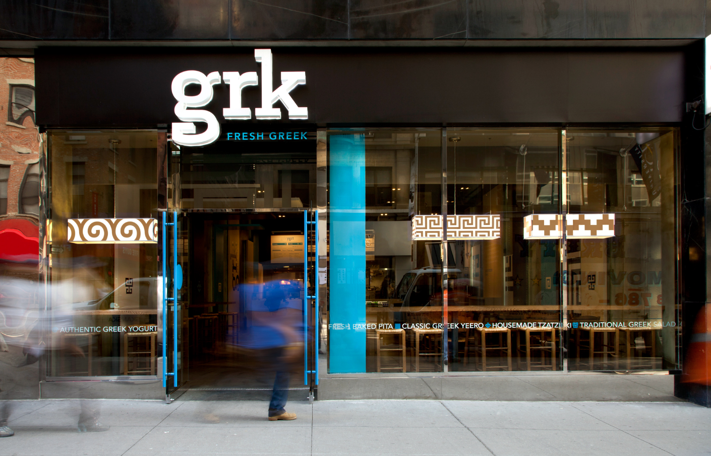
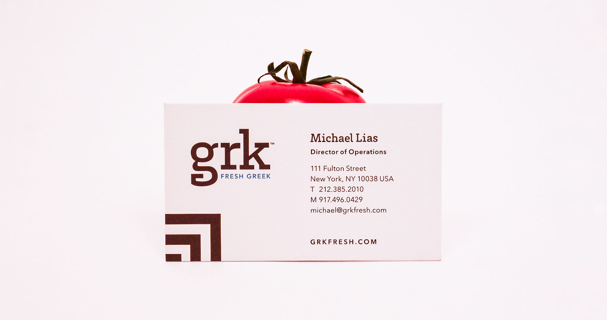
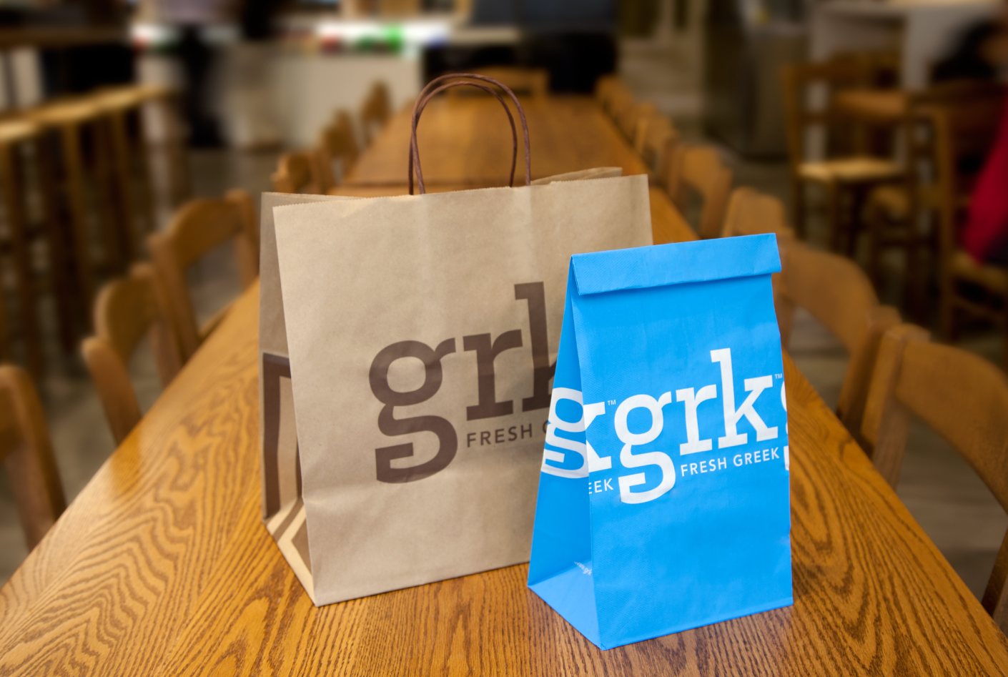
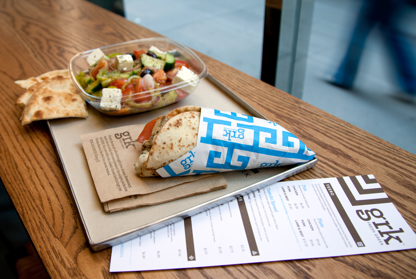
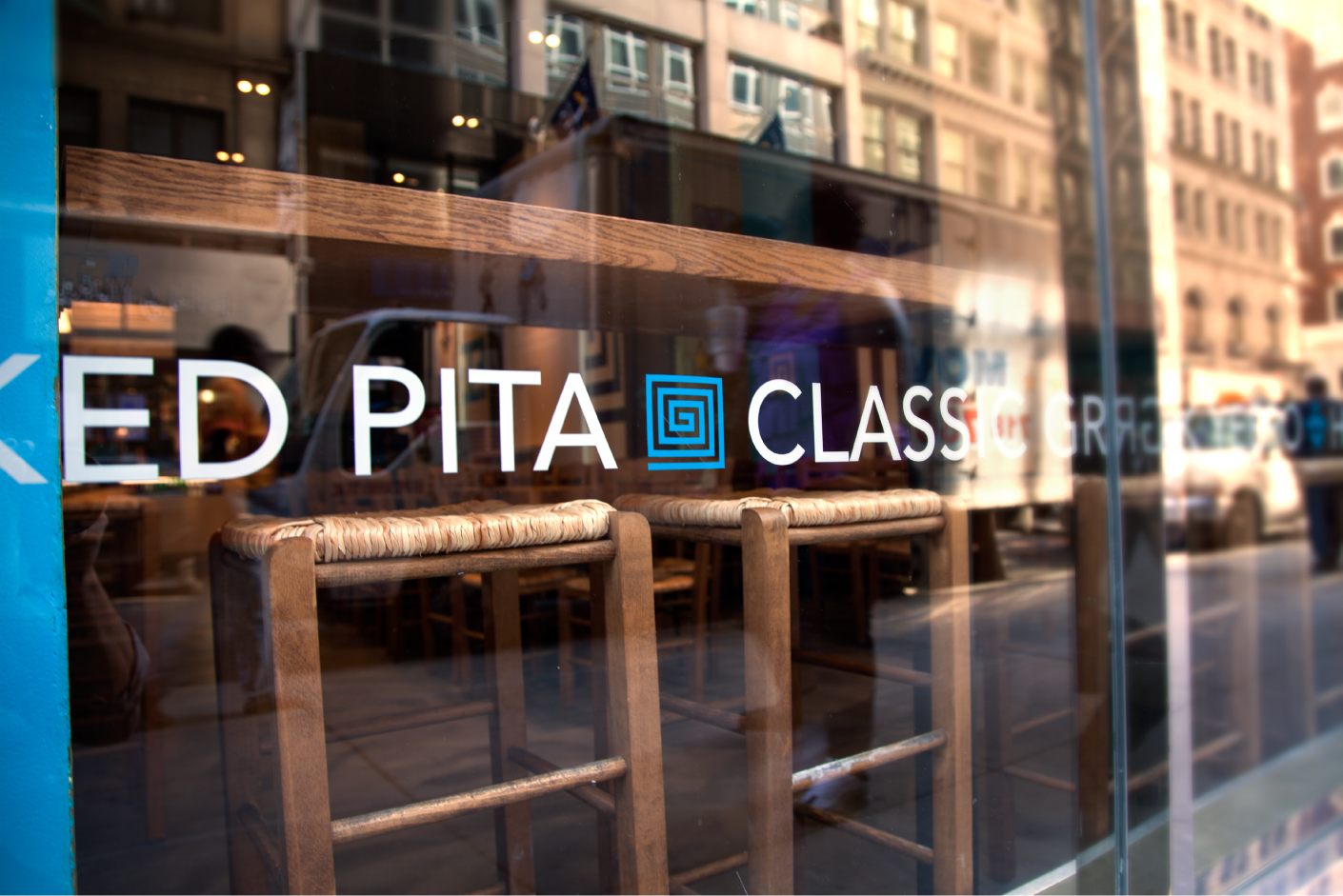
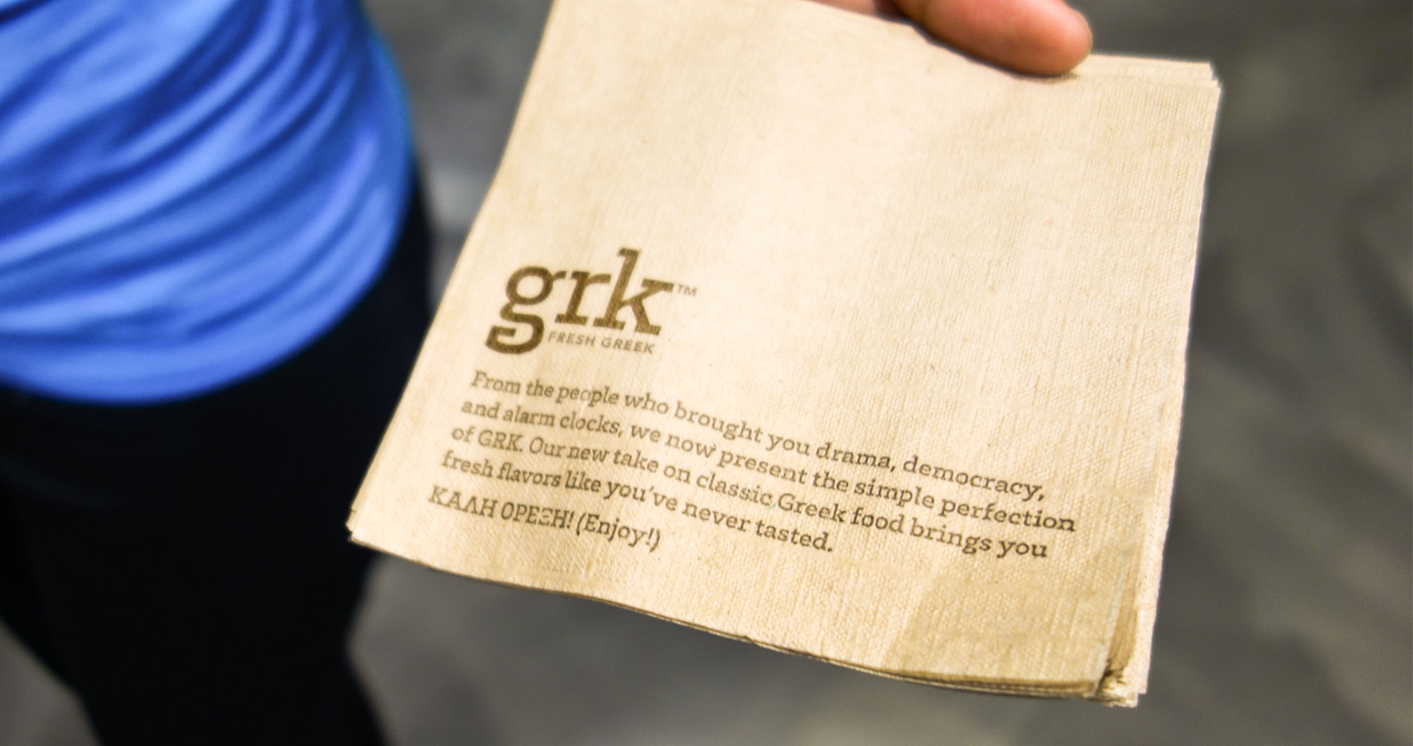
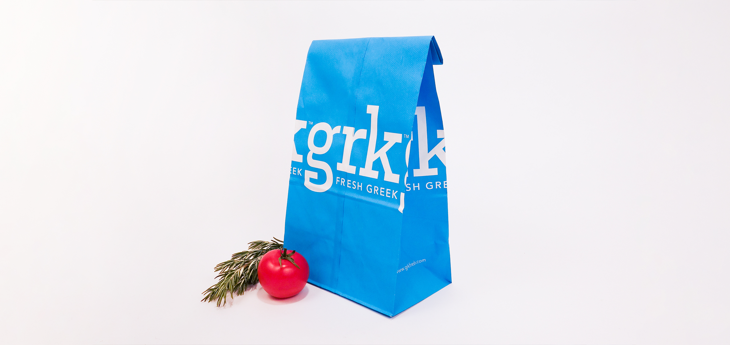
The founder started GRK to provide busy New Yorkers fast. I was the lead designer for this project to create design directions, finalize branding design systems, and print design items. To create a brand system that efficiently reflects GRK's freshness, fast, and authenticity, I decided to use colors, typography, and graphics people are already familiar with about Greece.

grk_windowsignage
GRK Window Signage.

DESIGN PROCESS

DESIGN DIRECTION 1

Design Direction 1
Design Direction 1 - I created a series of simple geometric patterns and customized typograhy in fresh colors to communicate the idea of simple ingredients with full greek flavors.
Design Direction 1 packaging design
For the packaging design in this design direction, I used minimum color pallete with a high contrast between the logo and the patterns.

DESIGN DIRECTION 2

Design Direction 2
Design Direction 2 - In this direction, I wanted to emphasize the authenticity of the brand's greek flavors. So I decided to customize the letter "g" with a classic greek icon. This design direction still uses fresh colors with more variety to present the rich and fullness of the food palette.
Design Direction 2
For the packaging design for this direction, I created two different food bags, one for frozen yogurt in white and one for hot food in brown paper. I mostly reserved the light blue specifically for the frozen yogurt series at GRK.

FINAL BRANDING DESIGN

Storefront design.
Storefront design.
Business card design.
Packaging Design for take out bags.
Menu and food packaging Design.
Window signage design.
Napkin Design.
Napkin Design.

TEAM

Simone Endres Art Director
JB Osborne CEO
Emily Heyward Strategist
Yuchen Zhang Art Direction, Visual and Logo Design
TOP